Monday, February 3, 2014
See the future of TV now.
Here's a whole new TV viewing experience, I know you've seen this in all those Hollywood films, but this is a reality now, it takes watching TV to whole new level. TV isn't dead it just evolved into something that I find bloody amazing.
Labels:
Air,
AR,
business,
digital,
IA,
innovation,
interface,
Kickstarter,
Mashable,
motion,
sensor,
sensory,
smart,
tech,
technology,
touchscreen,
TV,
UX,
viewers
Friday, January 31, 2014
This is your captain speaking - Delta 80's
This made me laugh, 80's styling for Delta Airlines, making a very watchable safety information video, loving the little touches; back combed hair and body popping along the aisles. It's these nice little touches that make this shareable, baseball hat tip to you Delta.
Saturday, January 25, 2014
Best Conversion Rate by colour
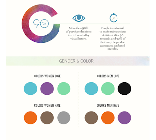
I have worked at various digital campaigns from finance to fashion brands and have always looked at how best to optimize the performance of the campaign. One thing I have learned is that you never stop learning and tweaking. Take this infographic from Quicksprount around the use of colour, amazing how one change of the CTA (Call To Action) button from say green to red can make all the difference in the success of a campaign.
I did a similar test for a campaign for one of the big banks in Australia 2 years ago - I was told time and time again that a green CTA gets higher click throughs - I asked where's the prove? No one had real concrete stats, just an assumption- as in; 'green is the colour for go!! an action colour some would say' Well, I said let's put it to the test, the outcome; red won hands down. It was one of the most successful campaigns the bank had ever ran.
Now I know what some marketing directors are thinking, 'I'll apply the colour red to all my CTA's' well, that would be a mistake, and here's why; trends change, people's behaviour change on what gets an interaction. So next time you run a campaign, look at reference like this infographic but always test and learn along the way. Some more info here
Labels:
advertising,
Australia,
business,
CEO,
clicks,
color,
colour,
conversion,
CTA,
digital,
infographic.,
marketing,
optimize,
optimized,
quicksprount,
stats,
trends
Friday, January 3, 2014
Real people in ads please
Unknown Germany artist pasted photoshop toolbar on fashion posters for H&M - Genius - real people in real life I say
You're a senstive soul.
Interesting visual social experiment conducted on a group of people around their emotions, visually very insightful especially when you show it as a heat map of their body. The two that really stood out was sadness and happiness they couldn’t be poles apart, when you look at happiness it is the only emotion to show an increase in sensation pretty much across the body while the only one to show no increase in sensation anywhere is depression. So next time you are feeling blue or you say; overall I'm pretty happy, you might have described it to a tee. Happy NY
Here's the full story and links
Google - an amazing story
This has been around for a while but if you haven't seen it - it is a cracker - just watch the film unfold, great story, great spot. Hat tip Google.
Labels:
content,
emotional.,
film,
Google,
idea,
marketing,
Story,
storyscaping,
storytelling,
TV
Friday, December 20, 2013
Skate Ballet
Love this as always when you get one thing and pair with something completely unconnected - you create something pretty special, this dude can pull some tricks. Nicely shot too, great storytelling.
Subscribe to:
Comments (Atom)


