Monday, June 16, 2014
Instagram Tree
Here's a wonderful campaign that is beautiful and unique that highlights the sad fact that the tropical rainforest is in real trouble, what happens there affects all of us. #TapForTrainers celebrates the amazing beauty of the Amazon, its wildlife and resources with a stunning installation in Instagram, supported by creative collaborations with some of the UK’s leading eco-fashion bloggers, designers and illustrators, such as Jean Jullien, AJ Odudu and the Boy from Dagbon.
Simply by tapping the tiles on our virtual tree, the work of illustrator Sandra Dieckmann, visitors uncover stories about the Amazon, alongside narrative from Lily Cole, Veja and eco-fashion influencers. Tree tappers can also enter a competition to win a pair of limited edition trainers made from responsibly sourced rubber. Sky Rainforest Rescue ambassador Lily Cole has created and are giving away fabulous limited-edition shoe collection with Veja, the French eco fashion brand. The soles of the shoes are made from Amazonian wild rubber, tapped from the Sky Rainforest Rescue project. A great way to tell the story by harnessing tech. Happy tapping, as this tree is going to keep on growing.
Labels:
Amazon,
blog,
bloggers.,
Eco,
fashion,
Illustrators,
Instagram,
Lily Cole,
marketing,
media,
rubber Tapping,
Sandra Dieckmann,
Sky rainforest,
social,
Tap,
WWF
Friday, May 9, 2014
A real caffeine hit
Love this, turning brands into functionality products - like Nescafe who've turned their cap into an alarm clock - I'm also loving the tactile design of the cap too. Nice connected thinking.
Labels:
brands,
coffee,
design,
function,
functionality,
idea,
marketing,
Nescafe,
product design
Sunday, April 20, 2014
Beautifully Sad
Solidarités International et BDDP Unlimited veulent faire couler de l'encre from ici Barbès on Vimeo.
I came across this on my feed and as I started to watch this film I was immediately transfixed. The choice of music really set the scene and the pace of the film was spot on in telling the harrowing story of millions of children who die each year drinking dirty water. Very sad to watch as it unfolded but at the same time watching the art direction coming to life was something else. Award-winning art direction in my view but more importantly it was a very clever way to dramatise the story and draw attention in spreading the word, and hopefully for all of us to give aid to Solidarites InternationalThursday, March 20, 2014
Teachers Pet
Well well, look who's teacher's pet SapientNitro's end of year report - great effort from the whole team within the offices, till next year.
Labels:
brand,
company,
connected,
creative,
digital,
global,
industry,
innovation,
London,
marketing,
PR,
sapient,
sapientNitro,
storyscaping
Monday, February 3, 2014
See the future of TV now.
Here's a whole new TV viewing experience, I know you've seen this in all those Hollywood films, but this is a reality now, it takes watching TV to whole new level. TV isn't dead it just evolved into something that I find bloody amazing.
Labels:
Air,
AR,
business,
digital,
IA,
innovation,
interface,
Kickstarter,
Mashable,
motion,
sensor,
sensory,
smart,
tech,
technology,
touchscreen,
TV,
UX,
viewers
Friday, January 31, 2014
This is your captain speaking - Delta 80's
This made me laugh, 80's styling for Delta Airlines, making a very watchable safety information video, loving the little touches; back combed hair and body popping along the aisles. It's these nice little touches that make this shareable, baseball hat tip to you Delta.
Saturday, January 25, 2014
Best Conversion Rate by colour
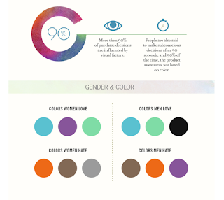
I have worked at various digital campaigns from finance to fashion brands and have always looked at how best to optimize the performance of the campaign. One thing I have learned is that you never stop learning and tweaking. Take this infographic from Quicksprount around the use of colour, amazing how one change of the CTA (Call To Action) button from say green to red can make all the difference in the success of a campaign.
I did a similar test for a campaign for one of the big banks in Australia 2 years ago - I was told time and time again that a green CTA gets higher click throughs - I asked where's the prove? No one had real concrete stats, just an assumption- as in; 'green is the colour for go!! an action colour some would say' Well, I said let's put it to the test, the outcome; red won hands down. It was one of the most successful campaigns the bank had ever ran.
Now I know what some marketing directors are thinking, 'I'll apply the colour red to all my CTA's' well, that would be a mistake, and here's why; trends change, people's behaviour change on what gets an interaction. So next time you run a campaign, look at reference like this infographic but always test and learn along the way. Some more info here
Labels:
advertising,
Australia,
business,
CEO,
clicks,
color,
colour,
conversion,
CTA,
digital,
infographic.,
marketing,
optimize,
optimized,
quicksprount,
stats,
trends
Subscribe to:
Comments (Atom)


