Friday, May 9, 2014
A real caffeine hit
Love this, turning brands into functionality products - like Nescafe who've turned their cap into an alarm clock - I'm also loving the tactile design of the cap too. Nice connected thinking.
Sunday, April 20, 2014
Beautifully Sad
Solidarités International et BDDP Unlimited veulent faire couler de l'encre from ici Barbès on Vimeo.
I came across this on my feed and as I started to watch this film I was immediately transfixed. The choice of music really set the scene and the pace of the film was spot on in telling the harrowing story of millions of children who die each year drinking dirty water. Very sad to watch as it unfolded but at the same time watching the art direction coming to life was something else. Award-winning art direction in my view but more importantly it was a very clever way to dramatise the story and draw attention in spreading the word, and hopefully for all of us to give aid to Solidarites InternationalThursday, March 20, 2014
Teachers Pet

Monday, February 3, 2014
See the future of TV now.
Here's a whole new TV viewing experience, I know you've seen this in all those Hollywood films, but this is a reality now, it takes watching TV to whole new level. TV isn't dead it just evolved into something that I find bloody amazing.
Friday, January 31, 2014
This is your captain speaking - Delta 80's
This made me laugh, 80's styling for Delta Airlines, making a very watchable safety information video, loving the little touches; back combed hair and body popping along the aisles. It's these nice little touches that make this shareable, baseball hat tip to you Delta.
Saturday, January 25, 2014
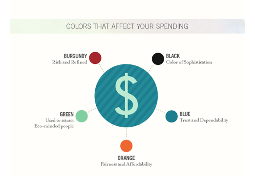
Best Conversion Rate by colour


Friday, January 3, 2014
Real people in ads please
Unknown Germany artist pasted photoshop toolbar on fashion posters for H&M - Genius - real people in real life I say


Subscribe to:
Posts (Atom)